5. Data Visualization
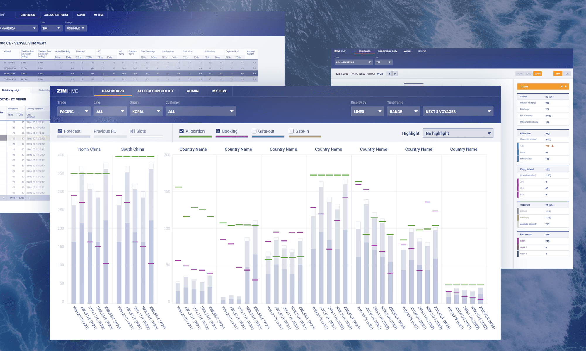
Making complex data accessible and insightful is an art. For ZIM, a logistics company, we tackled the challenge of designing a data dashboard that displayed advanced and multifaceted data across five different vectors. By focusing on readability and user-friendly infographics, we transformed their data into actionable insights.
© Image by ls.graphics
Design Challenges
Data Complexity: Ensuring that advanced and multifaceted data is presented in a clear and understandable manner without overwhelming the user.
Readability: Balancing detailed data presentation with readability, ensuring that users can quickly grasp the most important information.
User Engagement: Creating interactive elements that engage users and encourage exploration of the data, leading to deeper insights.
Solutions
Comprehensive Data Analysis: I conducted thorough analysis of ZIM's data to identify key metrics and determine the best way to present them.
Simplified Infographic Design: I developed clear and concise infographics that break down complex data into easily digestible visual elements, ensuring that users can quickly understand the information.
Interactive Dashboard Development: I designed interactive dashboards that allow users to filter and explore data, providing a dynamic and engaging user experience.
Get in touch
Whether you have a question, a project idea, or just want to say hello, I'd love to hear from you. Reach out and let's start a conversation.
Book a meeting